Showing posts with label images. Show all posts

Sunday, April 21, 2013

"My People" Photo Essay

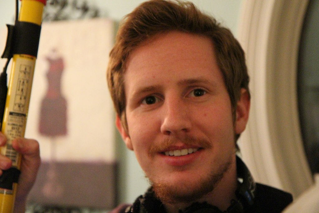
Me, with the camera I used to capture these pictures, the Canon t4i

My people are filmmakers. We may have different interests and we may have different jobs but we all come together for the same purpose -- to make a film. This particular film is called "Open House" and it is for the Screen Arts 423 class at school, the largest production class that the University of Michigan offers. We started filming on March 15 and finally wrapped April 14 early in the morning, about 2 am. During that month, every weekend (Friday, Saturday, and Sunday) I left campus and joined "my people" on set to make a movie.

Jackie Vresics, first assistant camera and camera operator, with the Sony F3

Although we had attended class together up to that point in the semester, we didn't know each other very well. Needless to say, over the course of that month I got to know everyone on our team, which numbered close to 30. Many of them are in the film department, but some were actors, some did art and design, and even a couple people were in business. We bonded over long shooting hours, pizza for dinner every night, broken equipment, and countless other challenges that we faced. In a way, they became my family. So when this photo essay was assigned, I knew immediately who would be the subject of my photos.


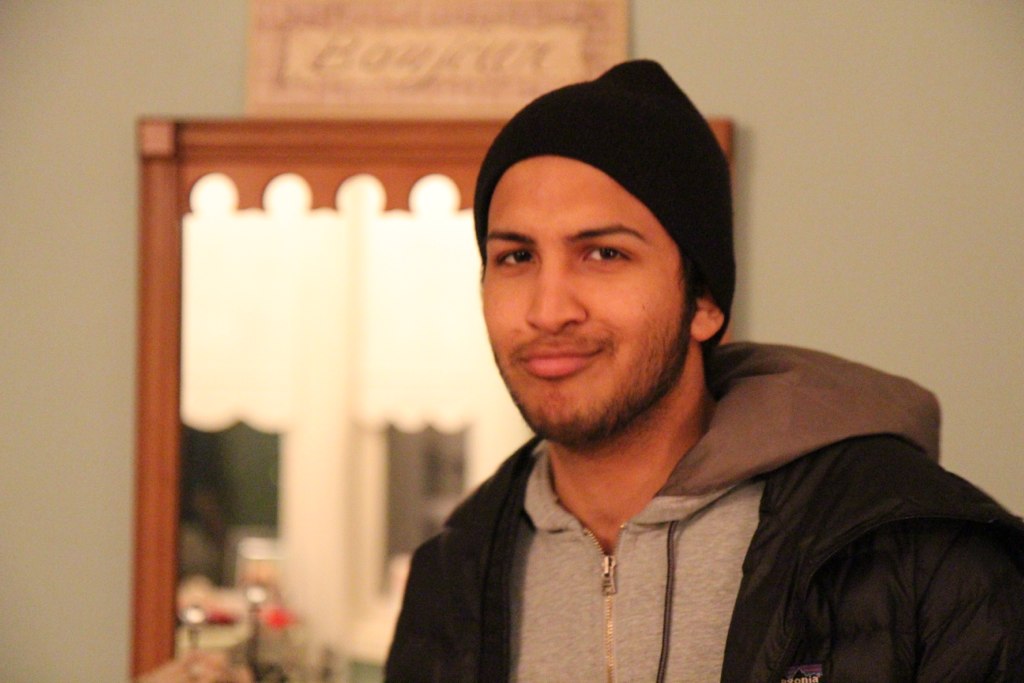
Rajan Sosale, the assistant director
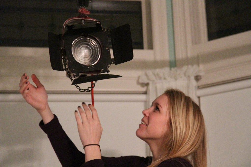
Julie Vis, key grip, sets up a light on set
For these photos, I chose to do them mostly in portrait, so I could better capture the personalities of everyone on set. I also thought portraits would be good because on set we were dealing with mostly low lighting (since we were filming at night) and I figured portraits would come out better than wider shots. I used the Canon t4i DSLR camera with a 17-55mm IS lens attached to take all these photos, but I had to mess with settings quite a bit.


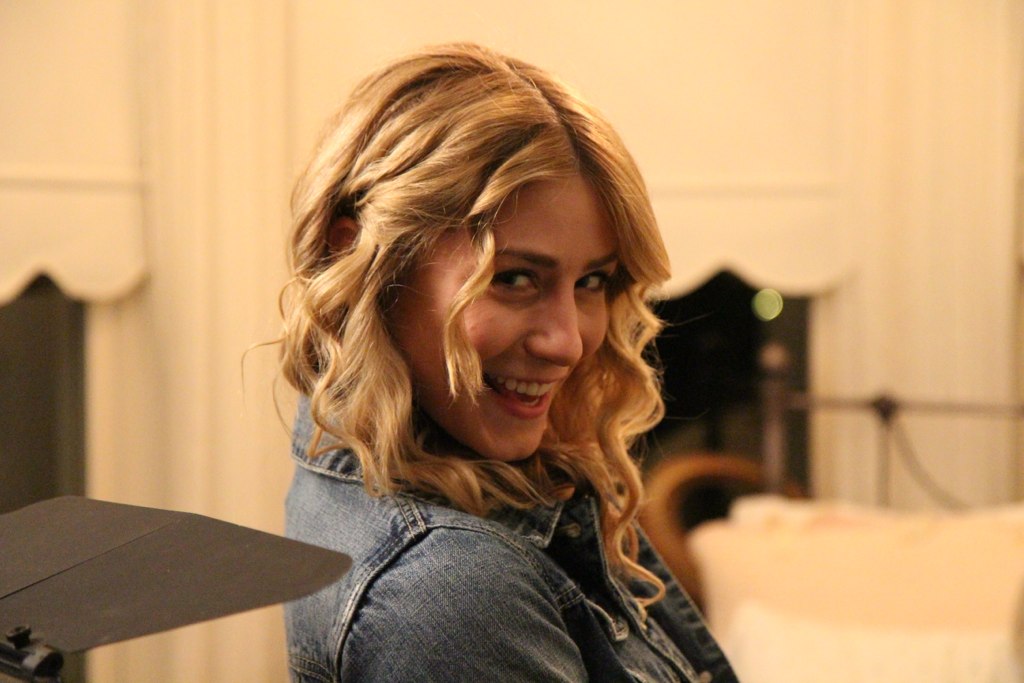
Quinn Scillian, actor, hamming it up for the camera
Phillip Maxwell, actor
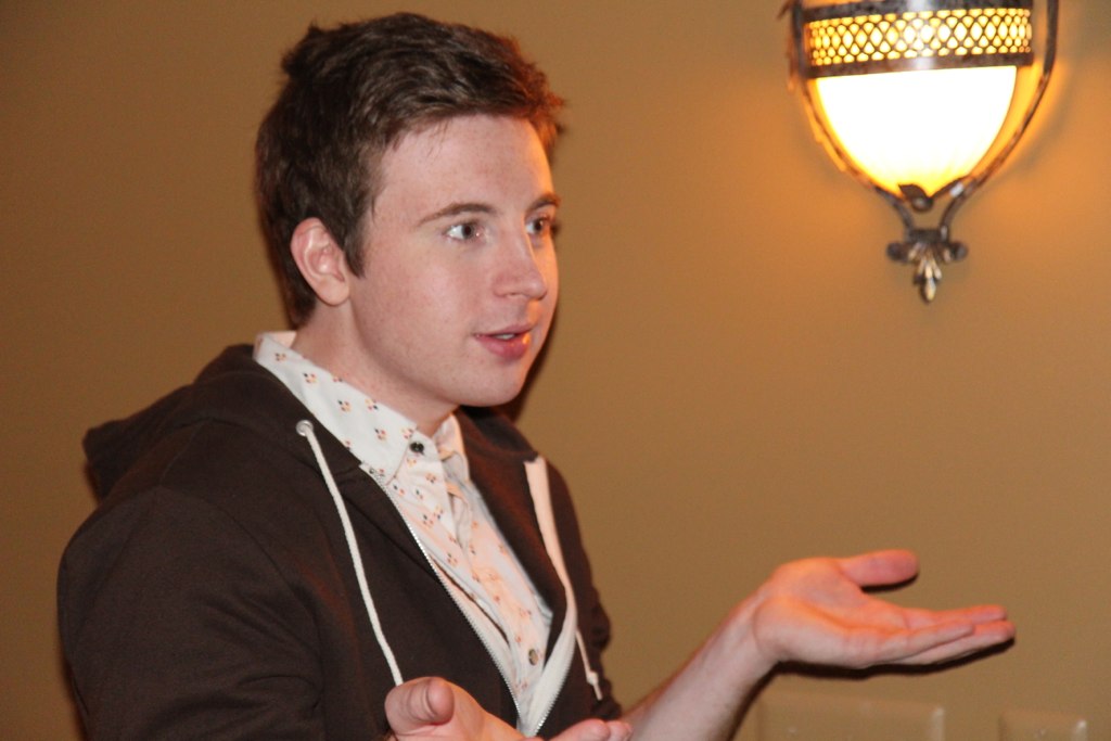
Nick Skardarasy, actor, gestures during the filming of a scene

Again, lighting was fairly dim on the set, so I took the pictures when people were standing near the lights. I tried to avoid flash as much as possible, because it tended to overexpose the whole image. I turned up the ISO a lot, which accounts for some of the grain in these pictures, shot with the aperture wide open, and adjusted the shutter speed as necessary.


Trend Hibbard, one of our sound recordists and boom operators, with boom
Kasey Cox, second assistant camera. She was responsible for the slate.
One of the biggest issues I ran into when shooting these pictures (I have a lot of outtakes) was focus. Because of the low lighting and the lens I was using, getting the right part of the frame in focus proved to be very difficult. Sometimes I used the auto focus, but when it didn't work quite right I adjusted focus manually. 

Putting up a tension pole to hang lights from is a group effort
Everyone was so talented, and really wanted to do a good job, and were fun, nice people to be around, so although we worked long hours and things could get a little tense, I looked forward to heading to set every weekend and seeing the whole crew. Everyone has a unique personality, and there are a ton of jokers and comedians on set who loved to mess around, and I wanted these photos to reflect everyone's uniqueness, even though we were all together to accomplish the same goal. The actors, predictably, put themselves on display when the camera turned towards them, but so did some of the other crew.

"My People" are the filmmakers who came to set every weekend, sometimes at 7 or 8pm and prepared to work until dawn, excited and ready to work. We had a lot of fun together, but we also worked really hard and the product of our work, "Open House" is a half-hour short film that will premiere at the Lightworks Film Festival in the Natural Science Auditorium next Friday and Saturday, the 26th and 27th of April.

Wednesday, April 17, 2013

Conflict in a Frame

Conflict between subjects


Conflict between textures


Conflict between colors

Sunday, April 14, 2013

Response to "Masters of Photography" documentary

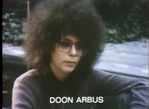
Holy crazy hair Batman.


I really enjoyed looking at all the photographs in this documentary, most of them pictures of people, while hearing quotes from Diane Arbus, as well as hearing other people talk about her who knew her.

One thing in particular that stood out was Marvin Israel talking about how for Diane, it was always about the experience of the photograph was important rather than about the photograph itself. That really stood out for me, because I feel like a lot of people are really obsessed with taking really great technical pictures, of taking really beautiful pictures, but for me that's not what it's about at all. It's not about taking a photograph and making it as beautiful as possible, it's about capturing the beauty of the moment itself as it occurs. The spontaneity and the experience itself makes the photograph beautiful.

Another thing I found interesting that was mentioned was that Diane liked "photographing freaks." It's interesting, again, because so often people are caught up in photographing a beautiful subject, but Diane found something beautiful or interesting in people who were maybe not objectively attractive, or were somehow different from the norm. It's a different kind of beauty, but I still find it very interesting that she chose to photograph those kinds of people.


Daily Shoot: "Rooting For Your Team" - Universal Theme

Untitled

Daily Shoot: A Photo of Something Normally Considered Ugly

Untitled

Daily Shoot: A Photo of Something's Shadow

Untitled

Daily Shoot: An Extreme Close-Up of a Recognizable Object

Untitled

Daily Shoot: A Self-Portrait

Untitled

Daily Shoot: A Portrait

Untitled

Daily Shoot: Photo With High Contrast

Untitled

Monday, April 8, 2013

Weekly Summary - Digital Storytelling

This past week we finished up our last design projects and dove into photography with several daily shoots. I started the week by making a couple minimalist posters and a GIF, as well as responding to the short story "Jon." The daily shoots were several different types of photographs. Lastly, I posted about 3-point lighting, something I've been learning a lot about lately in my production class.

The Perks of Being a Wallflower Minimalist Poster
Zou Bisou Bisou GIF
Response to "Jon"
Daily Shoot: Create a photo that features a repeating pattern
Daily Shoot: Take a photograph that emphasizes the sky by placing the sun very low or very high
Daily Shoot: Make a photo that looks better in black and white than it did in color
Daily Shoot: Take a photo that pays special attention to the rule of thirds
3-Point Lighting Setup

Wednesday, April 3, 2013

"Zou Bisou Bisou" GIF

To do this gif, I followed this tutorial. It took me a really long time to do, and I'm still not too happy with it (I think most of it has to do with the file size of the original video.) I skipped over the sharpening section, which maybe is why there is less color and more grain in the gif than in the original.

But I chose to do this because I love 30 Rock and I love Mad Men, and I remember laughing out loud when I saw this happen on the live 30 Rock episode, since I had just seen the corresponding Mad Men episode.


Monday, April 1, 2013

The Perks of Being a Wallflower Minimalist Posters


These pictures were relatively easy to make. I just found the images online, used the magnetic lasso tool to get just the typewriter and just the 45 single, added the text (courier new bold) and then filled in the green background. To get the right color I opened the original movie poster in photo shop and then used the color sample tool.

Sunday, March 31, 2013

Weekly Summary: Digital Storytelling

Lots of posts this week. We dove right into designing images. After learning some Photoshop basics in class, I used what I had learned to practice with the roller coaster swap and the album without sound, which I chose for my choice design assignment.

For the other assignments, I did the color splash, minimalist poster of a location, and Ted talk image. Finally, I found a minimalist image from the web that I thought was compelling, and shared my reasons for that.

I'm looking forward to next week's assignments!

Favorite Cover from "Albums Without Sound"
Roller Coaster Face Swap
An Album Without Sound
Design Assignment: Black and White Picture
Minimalist Poster - Jack Rabbit Slim's from Pulp Fiction
Ted Talk: Britney Spears on "How to Go Bald"
Minimalist Image Design

Minimalist Image Design

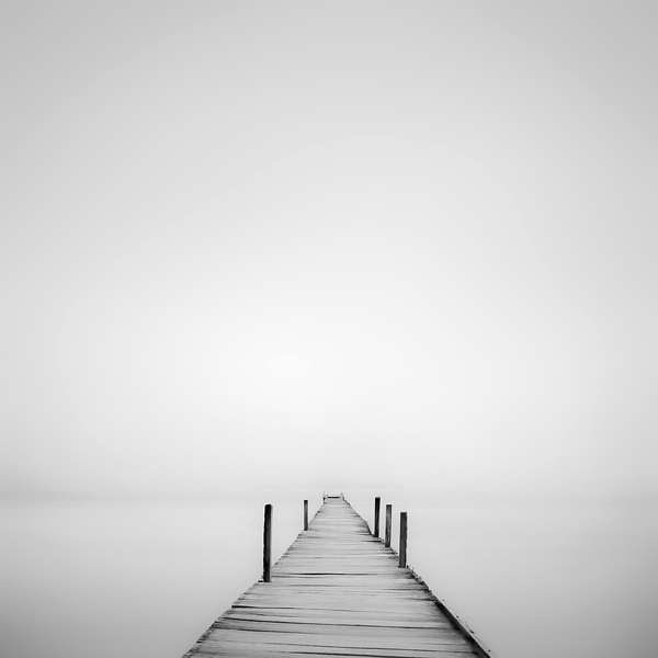
By Hengki Koentjoro, from here

This images is so compelling to me because of its simplicity. Of course, for it to be a minimalist image it must be simple, so that's no surprise. When I look at this image, I imagine that the dock represents my life, and I am continually stepping forward, out into the grey, the unknown. I can't tell what's in the distance; only the next few steps are clear to me. And I find that thought relatable.

This image kind of takes advantage of some of the concepts Williams discusses. There is some contrast between the edge of the dock and everything else, but the water and the sky would be completely indistinguishable if not for the faint line along the horizon.

The lack of color is repeated in the image, the color grey is everywhere, albeit in different shades. But being a minimalist image, there aren't a lot of different components in the image that can repeat themselves.

The dock is aligned in the bottom-middle of the image, and gives the impression of a point of view shot, which contributes to what I mentioned earlier.

And I'm not too sure how to apply proximity to this image.

Again, because this is minimalism, and the focus is on simplicity, the key to a good image is delivering a message using as few elements as necessary for it to still be effective. So the design has to reflect that.